
python numpy Matplotlib 绘图库介绍
Matplotlib 是 Python 的绘图库。 它可与 NumPy 一起使用,提供了一种有效的 MatLab 开源替代方案。 它也可以和图形工具包一起使用,如 PyQt 和 wxPython。
pip3 安装:
pip3 install matplotlib -i https://pypi.tuna.tsinghua.edu.cn/simple
Linux 系统也可以使用 Linux 包管理器来安装:
Debian / Ubuntu:
sudo apt-get install python-matplotlib
Fedora / Redhat:
sudo yum install python-matplotlib
安装完后,你可以使用 python -m pip list 命令来查看是否安装了 matplotlib 模块。
$ pip3 list | grep matplotlib
matplotlib        3.3.0
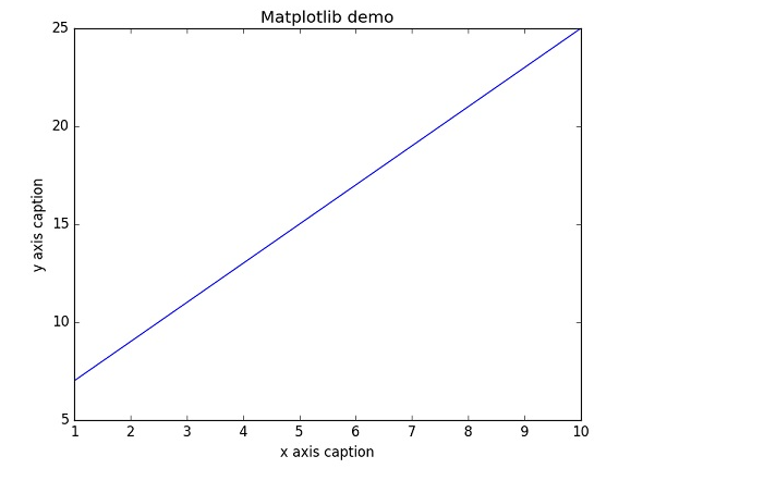
实例:
import numpy as np
from matplotlib import pyplot as plt

x = np.arange(1,11)
y =  2  * x +  5
plt.title("Matplotlib demo")
plt.xlabel("x axis caption")
plt.ylabel("y axis caption")
plt.plot(x,y)
plt.show()
以上实例中,np.arange() 函数创建 x 轴上的值。y 轴上的对应值存储在另一个数组对象 y 中。 这些值使用 matplotlib 软件包的 pyplot 子模块的 plot() 函数绘制。
图形由 show() 函数显示。
作为线性图的替代,可以通过向 plot() 函数添加格式字符串来显示离散值。 可以使用以下格式化字符。
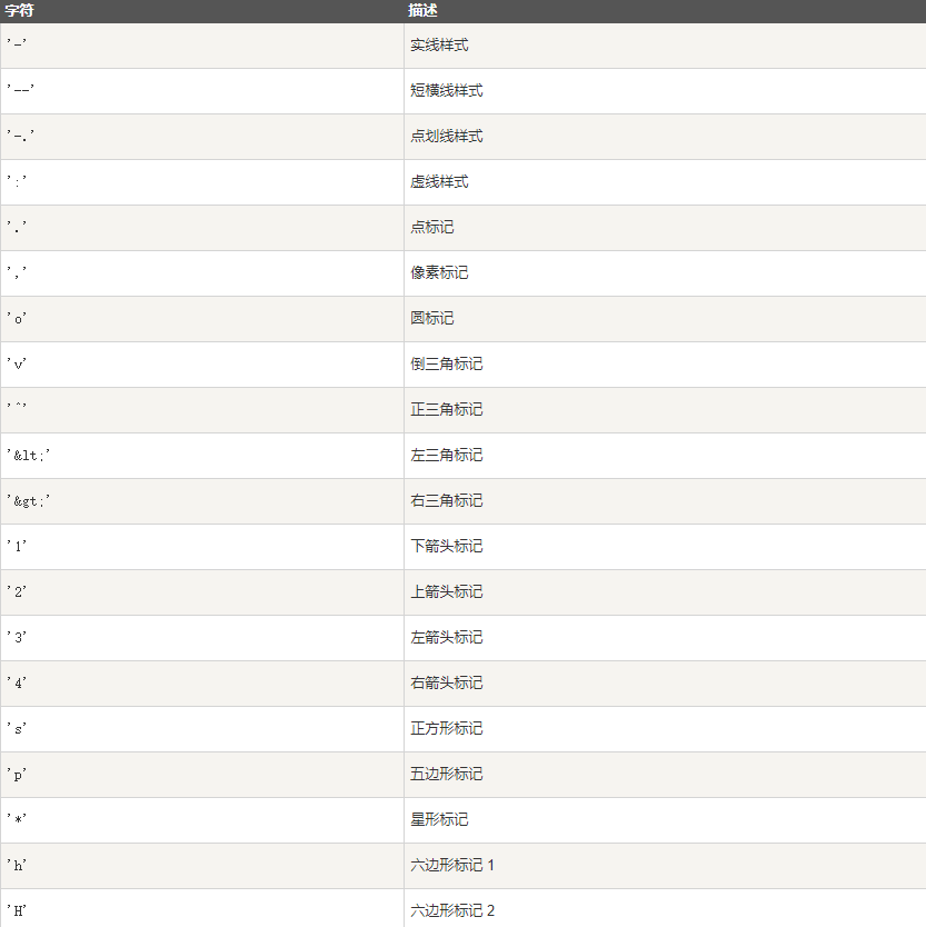
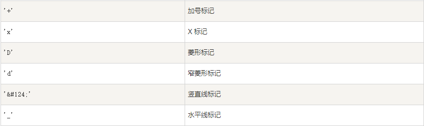
颜色值缩写: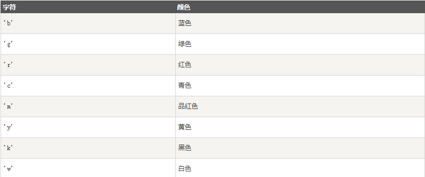
要显示圆来代表点,而不是上面示例中的线,请使用 ob 作为 plot() 函数中的格式字符串。
实例
import numpy as np
from matplotlib import pyplot as plt

x = np.arange(1,11)
y =  2  * x +  5
plt.title("Matplotlib demo")
plt.xlabel("x axis caption")
plt.ylabel("y axis caption")
plt.plot(x,y,"ob")
plt.show()
效果: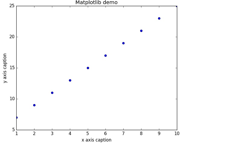
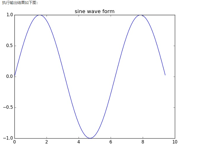
绘制正弦波:
import numpy as np
import matplotlib.pyplot as plt
# 计算正弦曲线上点的 x 和 y 坐标
x = np.arange(0,  3  * np.pi,  0.1)
y = np.sin(x)
plt.title("sine wave form")
# 使用 matplotlib 来绘制点
plt.plot(x, y)
plt.show()
subplot()
subplot() 函数允许你在同一图中绘制不同的东西。
以下实例绘制正弦和余弦值:
import numpy as np
import matplotlib.pyplot as plt
# 计算正弦和余弦曲线上的点的 x 和 y 坐标
x = np.arange(0,  3  * np.pi,  0.1)
y_sin = np.sin(x)
y_cos = np.cos(x)
# 建立 subplot 网格,高为 2,宽为 1
# 激活第一个 subplot
plt.subplot(2,  1,  1)
# 绘制第一个图像
plt.plot(x, y_sin)
plt.title('Sine')
# 将第二个 subplot 激活,并绘制第二个图像
plt.subplot(2,  1,  2)
plt.plot(x, y_cos)
plt.title('Cosine')
# 展示图像
plt.show()
效果: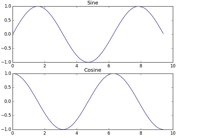
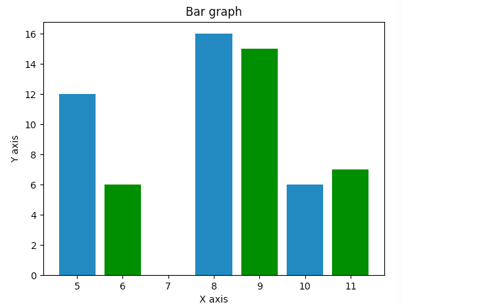
bar() 条形图
pyplot 子模块提供 bar() 函数来生成条形图。
以下实例生成两组 x 和 y 数组的条形图。
from matplotlib import pyplot as plt
x =  [5,8,10]
y =  [12,16,6]
x2 =  [6,9,11]
y2 =  [6,15,7]
plt.bar(x, y, align =  'center')
plt.bar(x2, y2, color =  'g', align =  'center')
plt.title('Bar graph')
plt.ylabel('Y axis')
plt.xlabel('X axis')
plt.show()
numpy.histogram()
numpy.histogram() 函数是数据的频率分布的图形表示。 水平尺寸相等的矩形对应于类间隔,称为 bin,变量 height 对应于频率。
numpy.histogram()函数将输入数组和 bin 作为两个参数。 bin 数组中的连续元素用作每个 bin 的边界。
import numpy as np

a = np.array([22,87,5,43,56,73,55,54,11,20,51,5,79,31,27])
np.histogram(a,bins =  [0,20,40,60,80,100])
hist,bins = np.histogram(a,bins =  [0,20,40,60,80,100])
print (hist)
print (bins)
输出结果为:

[3 4 5 2 1]
[  0  20  40  60  80 100]
plt()
Matplotlib 可以将直方图的数字表示转换为图形。 pyplot 子模块的 plt() 函数将包含数据和 bin 数组的数组作为参数,并转换为直方图。
from matplotlib import pyplot as plt
import numpy as np

a = np.array([22,87,5,43,56,73,55,54,11,20,51,5,79,31,27])
plt.hist(a, bins =  [0,20,40,60,80,100])
plt.title("histogram")
plt.show()
效果: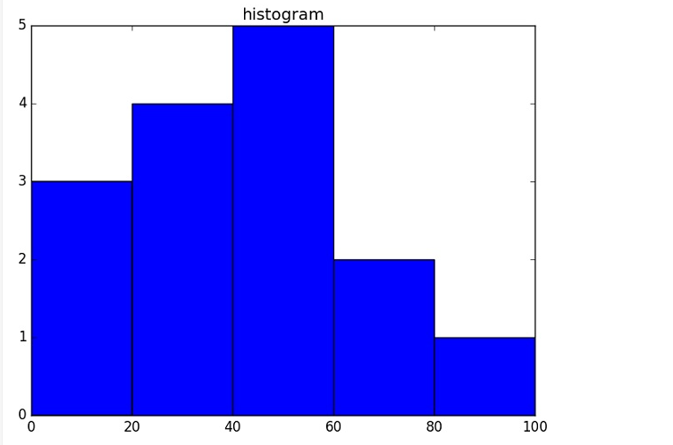
发表评论
取消回复